There’s nothing more luxe than a handwritten note. In an age of instant communication, choosing to write by hand is a deliberate act—one that values care over convenience. But the true luxury lies not just in the writing itself, but in the selection process that precedes it. Every choice signals intention; a handwritten note is designed from start to finish. Because the materials matter, there are a few key considerations when selecting your stationery:
- Paper weight and size: Thick, substantial paper conveys importance, while lighter stock feels intimate and personal. The tactile experience sets the emotional tone immediately. A small card suggests ease and familiarity; a full page creates space for reflection.
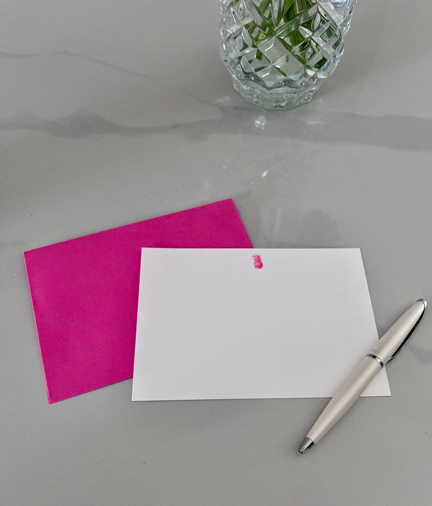
- Envelope choice: Often overlooked, the envelope is the first impression. Classic neutrals feel refined. Bold hues signal confidence or playfulness. A lined interior offers a private, unexpected moment.
- Color and tone: Crisp white feels timeless. Warm ivory softens sentiment. Subtle color adds personality without distraction. The wrong shade has the potential to overpower. The pen, too, determines the character of the note. Ink color—black, blue, or something more expressive—adds nuance without announcing itself.
- Handwriting: Margins, line breaks, and pacing matter. White space allows the message to breathe. Imperfections—slight wavering lines or crossed-out words—add authenticity.
Together, these decisions create an experience rather than a message. They tell the recipient that this was considered, assembled, and meant for them alone. In a world optimized for speed, the handwritten note endures because it is inefficient. It takes longer. It asks more. And that, precisely, is what makes it luxurious.

Leave a comment